Journal
The tools behind my logo design process
Jan 10, 2024
Computer
Popular
How I move between sketches, digital tools, and real-world checks to build a clear visual identity.
By Moksha Fernando · Personal notes
Give the idea a little room first
A logo project begins with understanding the business: who it speaks to, what it needs to express, and where the identity will appear. I want a clear direction before spending time refining a mark. A few useful questions can do more for the project than a large folder of unrelated inspiration.
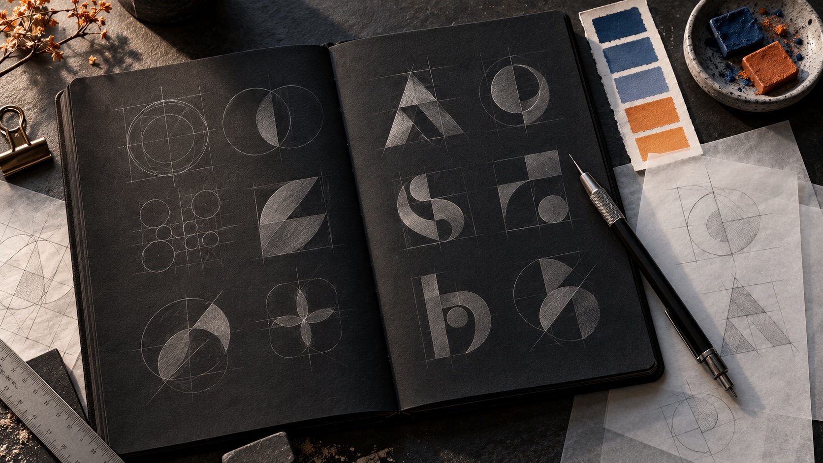
I use simple sketches to explore proportion, rhythm, and recognisable shapes. Paper keeps those early ideas flexible. It is easier to change direction when I have not invested hours in perfect curves.
Choose the tool for the stage
Figma, Photoshop, and Sketch are part of my wider design toolkit. I use digital tools to compare directions, organise references, and present the identity in context. For final logo artwork, clean vector construction and reliable exports matter more to me than the name of the application.
The tool should make a decision easier to test. I want to compare a small mark beside a wordmark, try different spacing, and check how the same identity behaves across a few practical uses.
Look beyond the large presentation
A logo can look convincing in a big mockup and still lose its character at a small size. I check simple versions, a single-colour treatment, light and dark backgrounds, and compact placements. These checks help me spot details that are too delicate or proportions that need more work.
Make the identity easy to use
The final handoff should help someone use the identity consistently. I aim for clear files, sensible colour references, spacing guidance, and examples that explain the intended use. Good tools support the process, but the real value is a thoughtful idea made practical enough to live beyond the design file.